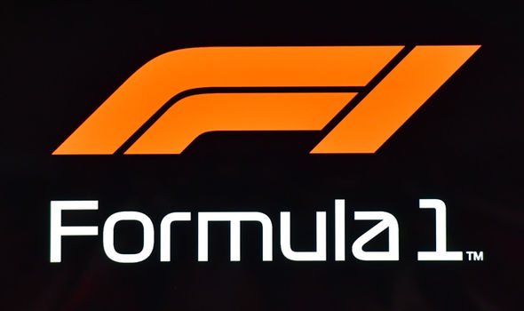
F1’s new logo is causing quite a stir in social media but it’s not like this design team didn’t know what they were doing if their previous work has anything to say on the matter.
Formula 1 is doing some major renovation to how it interacts with its fans and a new logo, however controversial, was one of the first major steps for this brand team. According to an article that’s been making the rounds on social media earlier this weekend (Nov. 25, 2017), the brilliant minds behind this new logo have quite an impressive portfolio, including one of the most memorable ads in modern history. Furthermore, there’s more than meets the eye when it comes to this simplified F1 logo.
Formula 1 unveils a brand new identity today following the #AbuDhabiGP. We talk to @W2Optimism’s Richard Turley about the new logo and suite of typefaces that look to the heritage of the sport while aiming to drive it forward @F1 #Unleash2018 #F1 https://t.co/NUvuHWF0KB pic.twitter.com/V4JbG90xhd
— Creative Review (@CreativeReview) November 26, 2017
W+K Richard Turley, the design team behind this new logo, felt that after exhaustive research, they found that today’s fans find themselves disconnected from the sport and what it’s become. The article mentions that fans felt the glory days of F1 where far behind them. This new logo is one of many opening salvos that hopes to reconnect fans to the brand. At first glance, the oversimplified logo doesn’t seem like much, but according to Turley,
The logo is constructed from three simple shapes that form an ‘F’ and a ‘1’ and that evoke both the speed of the cars and the bends of a racetrack.
And that’s exactly what Turley wants this sport to be known for, more the cars, drivers, and stories behind them than the engineering and third-party sponsors.
Like any curious fan of the sport, I went to see what other kind of work this design team did and to my surprise, they were responsible for one of the most widely known ads of all time. The Honda Accord Tourer might not ring any bells but if I mention “that one Honda cog commercial” to you, you’ll know exactly what I’m talking about.
At two minutes long, it’s four times longer than a regular commercial, but the mere fact that they used a Rube Goldberg machine means that most viewers probably stuck around for the entire commercial to see the end result, not something easy for an ad company to do.
In addition, they were the brilliant minds behind that one Honda Civic Type R commercial where you can toggle between situations. Although the interactive video site is no longer alive, you can still see a demo of it.
While some people may be upset at the logo change at first, there’s a reason behind what they’re doing. Perhaps it’s such an innovative design that the mere fact that it’s caused such a stir and got people talking about the sport like they are is all part of the plan.


